(...continued from the previous post)DefinitionThe naming of achievements is important, but pretty straightforward so I don't have much to say about that other than pointing out the obvious: players like names that are fun/interesting/provocative/cool/punny/etc. There were plenty of opportunities to come up with a variety of names when there are so many achievements :D
Of course there are a lot more details to creating a good set of achievements beyond simply choosing and naming them!
NumbersWhile a lot of achievements are essentially binary ("player did X"), many others involve reaching certain thresholds, which usually means numbers. It was really nice to have so much
score sheet data (including archives) and
past analyses to draw on in order to set realistic values for these numbers.
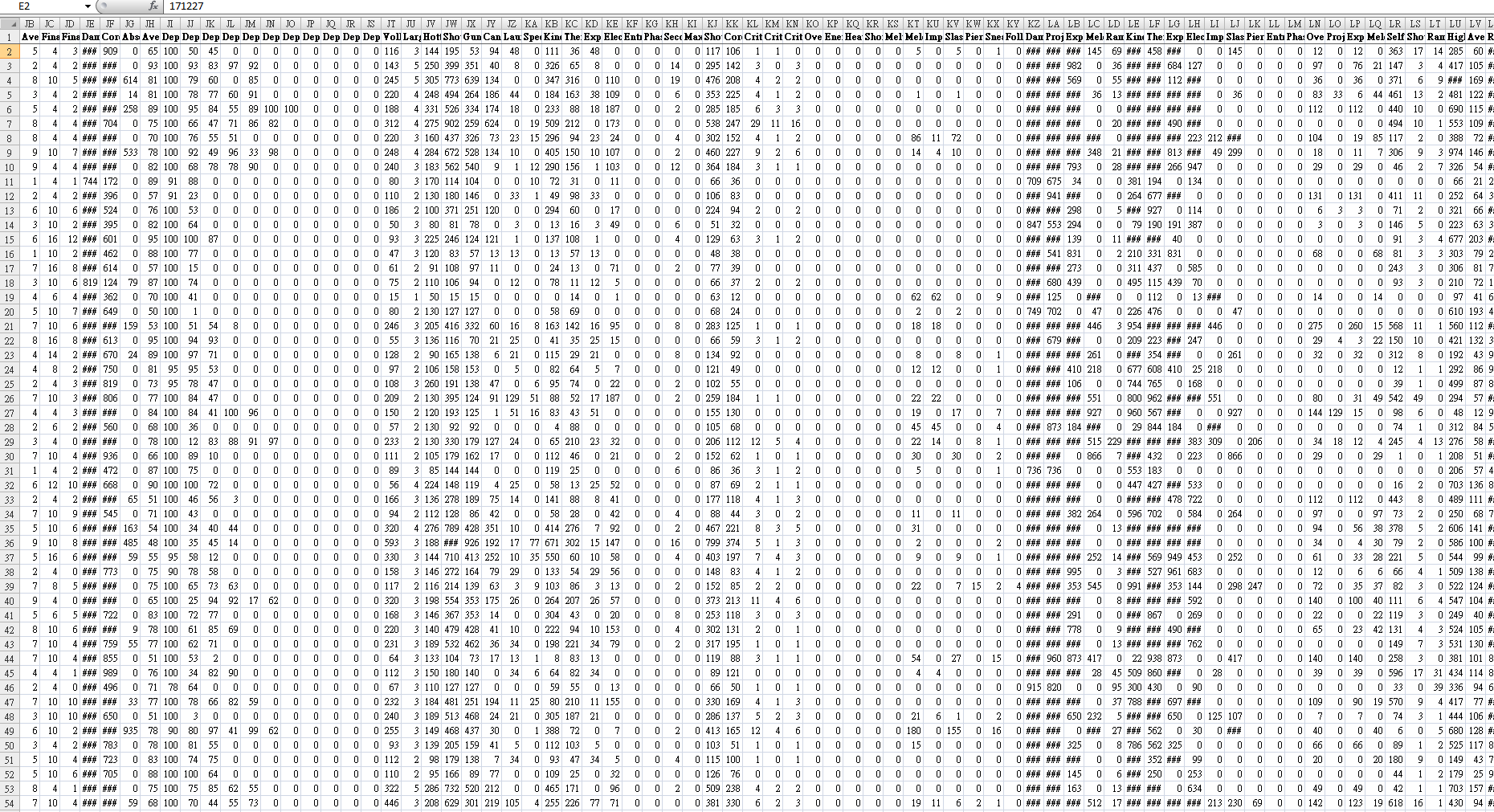 Excerpt of run stats from Beta 4 (the full table includes 446,028 data points). Filtering and sorting this data is able to answer a lot of questions about balance and difficulty, suggesting potential achievement requirements.
I could adjust the difficulty of an achievement based on the precise reported performance of players in earlier Betas, and further informed decisions by recalling anecdotal evidence from player discussions over the years--I'm always listening to stories and this continues to help shape the game in numerous ways, the most recent example of which being achievement design. Being pretty familiar with the game myself (I'm decent at it and enjoy playing, too :P) also provides some important context for creating reasonable achievements for all skill levels. So in the end details emerge through a combination of hard data and subjective experience.
One of the things I wanted to avoid in the number department are a lot of repetitive achievements, as these aren't very meaningful. For example there are many different types of robots, but we don't need dozens of varieties of "destroyed 10 of this robot." In fact there are almost none of that type of achievement except where doing so is especially interesting, as with the Giant Slayer achievement discussed earlier.
DescriptionsNames can be fun and in a lot of cases not perfectly descriptive of the achievement, but descriptions themselves had better be clear. These I wrote (and sometimes rewrote, on later passes) with a mind towards "what are players going to ask about this achievement?" "What's not clear?" Once descriptions have satisfied that condition, they're also checked for consistency of tense, grammar, style, etc. (basically what should be done with any game writing :P), and at the end I ran a spell check on the final set to ensure no typos were overlooked.
Hidden?Steam achievements don't have a wide range of functionality, but do at least support marking an unearned achievement type as "hidden," which shows only its name and whatever icon is associated with that state. (Or on the global achievements list for a game it'll show the achievement's icon and name, but still no description.) This offers some interesting possibilities, so I enabled the same feature in Cogmind and in order to take proper advantage of it spent some time thinking about reasons for whether or not to hide an achievement:
- Plot spoilers is an obvious one. There are numerous plot lines and points to explore across different runs, reaching almost any of which can be considered an achievement in itself since every single one is off the beaten path. But I've always been spoiler-averse, not wanting to ruin the discovery aspect of the experience, so plot-related achievements (or any others dealing with "special content," even if not necessarily connected to the plot) are all hidden.There is one plot-related achievement, "Origins," which is not hidden but instead given a vague description ("Discover what you really are.") and meant to be a teaser of sorts for any new or potential players just browsing the global achievements list on Steam. It hints that there's more to even the basic premise for the story than one might guess.
- A handful of special achievements I wanted to hide for spoiler reasons, but doing so would make it very difficult for players to discover them so I had to keep those unhidden. In this case it's useful to rely on a "middle ground" approach: Make the description vague enough that the average player won't know what it refers to, but experienced players will be able to accurately guess the requirements.
- Actions that require specific behavior which is boring to set up with the intent to earn an achievement, but otherwise fun to recognize when it happens organically, should be hidden. This goes along with the general game design principle of "don't reward tedium." There are only a few of these, but they're fun :) (as I write this article Cogmind's achievements have been in prerelease testing for a short while, and already I've got reports from players laughing at these)
- While it's fun to recognize achievements that can be earned organically, and certainly many can, sometimes where the intent is to get players to explicitly try different styles it's best to leave them unhidden. For example the Explosive Specialist achievement from earlier would be fun if and when earned suddenly by players focusing on that style, I believe it's more valuable to use as a suggestion for any players browsing the achievements for something they might want to aim for. (In the same vein, Gun/Cannon/Melee Specialist also remain unhidden.)
- "The Most Popular Achievement" (an actual achievement name :P) is a special case worth discussing, as it's quite vague and also hidden. This one, awarded on a player's first death, has several uses. First of all it takes the sting out of a loss, pointing out that this is a normal thing that is likely going to be a frequent occurrence. It'll also be the one achievement that anyone who plays will have, meaning it will top the Steam global achievements list--as a hidden achievement (remember that means there's no description) this makes it kinda intriguing to potential players who open the list. As the "guaranteed achievement" it also serves as an indicator of the percentage of people who've actually played through a run. Unfortunately this percentage will remain low at first since a lot of owners are waiting until Cogmind is out of Beta, and too bad achievements weren't around when a huge percentage of players tried it for a bit during the EA launch, but I'm sure we'll be seeing more players jump back in with the Beta 6 achievements release, and of course 1.0 later, and can use that number to follow the trend.
When creating an achievements list, my approach was to "assume hidden is the default state, what should I hide?" But another game might take the opposite route and come out with different results, i.e. hide everything and only reveal what's absolutely necessary (or nothing at all?).
Some players might even prefer this, because then they feel less obliged to play in a specific way and either all the achievements are surprises, or any descriptions that do exist might instead just be indirect
clues to figuring out what that achievement requires. This would allow for an extra sense of accomplishment on earning one, but I decided not to have any like that for now. Maybe in the future as a fun expansion, depending on how players fare with the initial batch. (Note their icons could also contain clues, or not since icons for displayed achievements before they're earned can be non-specific.)
Of the final set of Cogmind achievements (as of Beta 6), 31.2% are hidden, exactly half of which are for plot-related reasons. Therefore 15.6%, or about one-sixth of all achievements, are hidden for one of the other reasons.
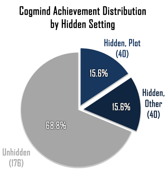 Initial hidden setting distribution for first batch of 256 achievements.
Oh my... When you've got 256 achievements, not only do you need good names and descriptions, but also a whole ton of icons to represent them!
At least ASCII art is fairly quick to produce, and I didn't have a choice with the style anyway, because 1) I am not capable of producing anything else decent, and more importantly 2) all of Cogmind's art must be
CP437 in order to fit in the game (remember that Steam is the sideshow in this system--the game itself has even more achievement-related features).
I did, however, have to ensure from the start that icons would
also be compatible with Steam. Their system requires 64x64 JPGs, in which I can fit up to a 5x5 grid of 12x12 pixel ASCII (12px happens to be the default size at which I draw ASCII art), so 5x5 it is.
But icons also need a border, and inserting a border into a 5x5 grid means all that's left for content is a 3x3-cell interior! This seemed ridiculously limiting, especially for "abstract" achievements, so after coming up with the initial list of achievement ideas I went through each category and sketched about 20% of them (since each category represents a different set of concepts). It started out well enough, and wasn't nearly as time-consuming as I'd feature it would be, either, so amazingly it actually seemed like this would work out in the long run. Limitations leading to interesting results is basically a cornerstone of Cogmind development, and this ended up no different :P
Thanks to
REXPaint the drawing part was quick and easy, but it took longer to both establish the symbolism and ensure it was consistently applied throughout all of the icons. It was definitely fun working with the symbolism, and later when I started sharing batches of icons some regular players were pretty good at guessing the meanings of each, even without a description! (of course it helps greatly to have an understanding of Cogmind's ASCII mode...) So I think the system has worked out pretty well.
In terms of productivity, as usual it helped to draw all the icons over a very short period, making it less likely I'd forget some of the symbolism and either make mistakes that would need to be discovered later, or slow down the process by having to repeatedly review such a large collection of icons before continuing.
I also drew them all in a single file to make cross-referencing as quick as possible.
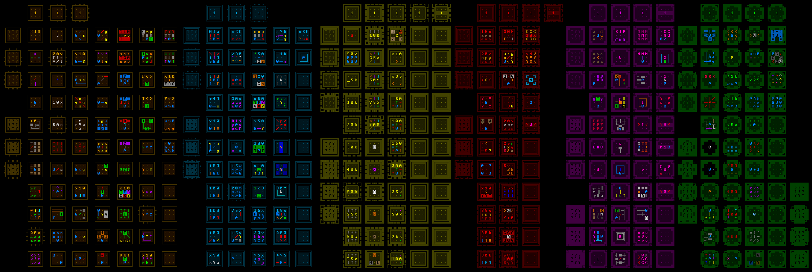 Cogmind's complete achievement icon spritesheet as it appears in REXPaint. The code knows how to extract the icons and which is which.
Looking closer at the structure of individual icons, there are two main ways to differentiate categories: border style and color scheme.
Border StyleSince nearly
two-thirds (64%!) of the cells in an icon will be occupied by borders, they'd better be put to good use. Their first priority is to reflect an achievement's category--each should have its own unique style. The most basic category has the simplest style, but decisions for other categories had to take into account another factor: how many difficulty tiers would be required within that category. Some potential border styles naturally lent themselves to a greater range of modifications, making them more suitable for multi-tiered categories.
Before starting on the icons, I first designed a large collection of different borders, seeing which looked bad, decent, or good, and which could be expanded into a natural progression of multiple tiers. It's from that page of concepts that I'd pick the final set which best matched up with the requirements.
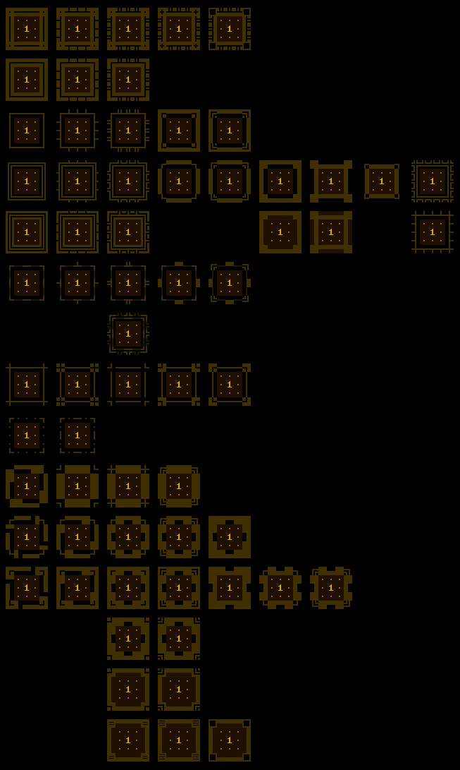 Achievement icon border style concepts. I generally started with an idea on the left and changed only one aspect of it for each new iteration moving to the right, or sometimes up or down if I wanted to try taking the concept in a different direction.
Higher tiers would need to look "cooler," essentially more intricate or elaborate. I eventually settled on this arrangement:
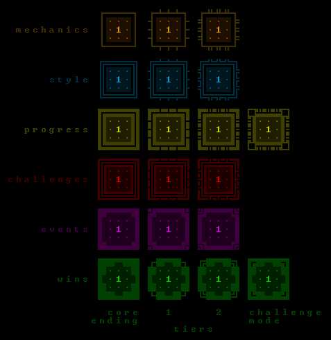 Final Cogmind achievement icon templates by category and tier, colored.
The Wins category doesn't use its full range as a "progression," as it has four border styles but only two tiers. The other two borders are for special subcategories of wins, specifically the core seven different win types according to plot, and challenge mode wins, so these have a different look from the tiered "special condition wins."
Color SchemeBorder style is not the only way to differentiate categories--each has its own base color as well (demonstrated in the above template matrix).
Colors were picked with purpose. As an "extremely Cogmind" color, green is used for one of the highest level of achievements, Wins. As a "powerful, deadly" color, red is used for the special Challenges. As a category of "basic" achievements that don't really need to stand out, the Mechanics category uses dark amber (somewhat close to brown) as its main color. Colors for other categories were chosen for somewhat less specific reasons :)
Border colors for the templates are all dark, at 25% brightness (and backgrounds are even darker at 12%), but each category also has a base foreground color (100% brightness in the same shade) used for generic content like numbers. This way the numbers, as secondary bits of information, are somewhat connected to the category and background/border itself, at least more so than most other elements that make up the interior.
 A sample of Style category icons with generic number components highlighted.
Most foreground characters are all quite bright as well (usually 70-100%), so while the border and background colors serve a supporting and informational role, they don't take over the entire icon.
As for icon interiors, colors used there are drawn from Cogmind's ASCII mode where possible, although in some cases alternatives were needed where a concept is not already associated with some specific color (sometimes required for abstract icons). Again though, in all cases colors were chosen with purpose, and where a concept is repeated across multiple icons those colors are applied consistently.
Locked (Unachieved) IconsLocked achievements need a display icon as well, and there are about three ways to handle them:
- Use a grayscale or muted/darkened version of the unlocked icon. Most games seem to handle it this way, and it's the recommendation from Valve.
- Use the same icon to represent any locked achievement. This is a lot less common, but some games do it. I guess it has the advantage of making the actual icon part of the surprise/reward on achieving it. Hiding the icon contents also removes yet another clue as to what a hidden achievement might be referring to, becoming a truly hidden achievement aside from whatever information is suggested by the name alone.
- With enough achievements to divide them into categories, a separate icon can be used for each category, but used across all achievements in that category. I went with this approach to further emphasize the categorical nature, and because it helps break up what would otherwise be a huge mass of identical icons if I went with the second method above. (For the same reason I don't like the idea of grayscale versions--too much information value is lost when this many achievements are at play.)
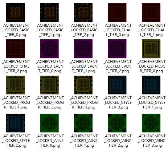 Locked achievement icons.
Note that locked icons also reflect the relevant tier--essentially these icons are equivalent to the templates, with the interior replaced by dark question marks.
As for those PNGs, they are exported from the game via debug command in order to convert them from the internal format and assign proper file names. This isn't necessary for the default DRM-free version, but again Steam requires that achievement icons be 1) JPGs, and 2) 64x64. So I created a tool to output all icons, then use Photoshop to batch convert from PNG to JPG while also adding a 2-pixel black border around each (since in Cogmind their dimension is 60x60).
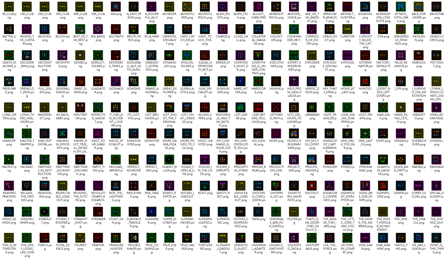 256 Cogmind achievement icons, exported as individual PNGs.