1
Early Dev / Re: The Thirty One Lieutenants of Sorcerer Bedsui - (Squad Based, Java, Fantasy)
« on: February 03, 2018, 04:28:08 PM »
This month in development:
Project Site: http://antumbrastation.com/bedsui-project.html
Latest Version: 20180201
I’m back at development after a nice Christmas/New Years vacation, and this year starts with a gutting and rework of the user interface. Mainly replacing the command line with a more conventional mouse based interface. It took a solid month of coding, but the new mouse based interface is in a playable state (check out the latest release!!), and I’ve ripped out the last of the old command line code.
New Framework
Each time I've overhauled the game's interface (this is the third time), I first made a new interface framework before doing any of the actual interface work itself. The framework provides constraints which help with interface consitency, and the framework also provides a good architectural foundation to help the code quality.
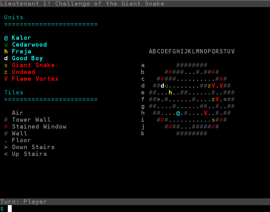
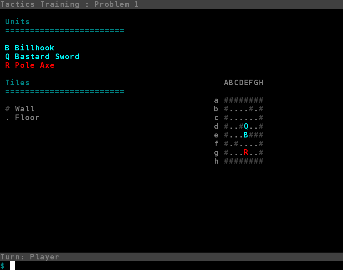
Normally with these frameworks, the interface doesn't directly affect anything in the underlying game state. There is a list of commands, and the interface allows user to request one of those commands, but the command class itself (an not any interface code) makes the requested change to the game state. With the command line inteface, the arrangement was very basic; each available command had a name, and the user was just typing out the name of which ever command they wanted.
To make the new mouse interface easier, I've designed a tree based model for describing commands.
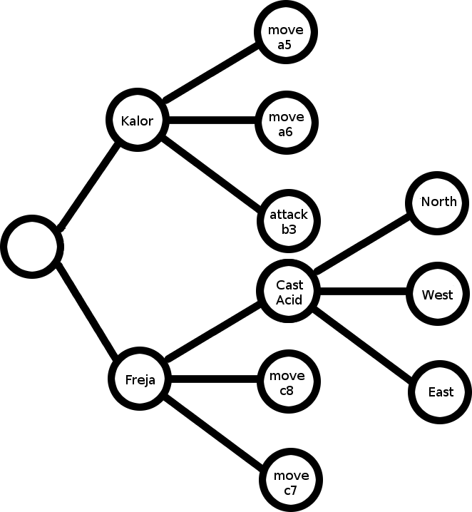
The start state for the user interface is the root node of the tree. Each node represents a piece of info for a command, and each complete path from root to leaf node is a complete command. The commands in the example tree are:
As the user interacts with the interface's current view, the user advances the interface through different nodes in the tree, and when a leaf node is reached that path formed from the root is the chosen command. At each node, the interface updates the view to show information relevant for choosing the next node.
The command tree is made pretty explicit at the bottom of the interface:

This widget can be used to directly move about the nodes of the command tree.
The Combat Interface
The new combat interface front-loads a lot more information.
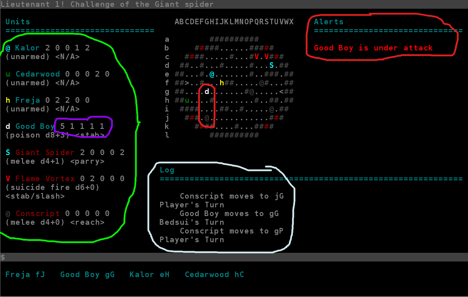
Circled in red are important things the player needs to know but otherwise might overlook without a reminder. In this case one of the player's units, Good Boy, is within the range of enemy attack.
Circled in light blue is the log, which now records more than one event at a time and records less important events such as enemy piece movement (which the command line interface did not alert the player to). Nothing exciting about the log, it's the norm for roguelikes.
Circled in green is the new unit directory. My hope is that this will serve as a heads up display, letting the player know the defense stats (circled in purple) and melee attacks of every unit at a glance.
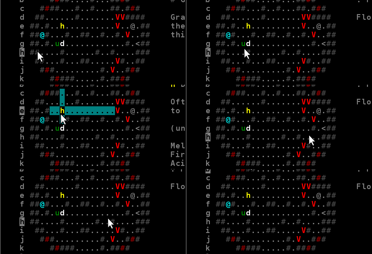
And as seen in a previous update, the battle map is mouse responsive and is the primary way I intend the user to select combat commands.
The Battle Preperation Interface
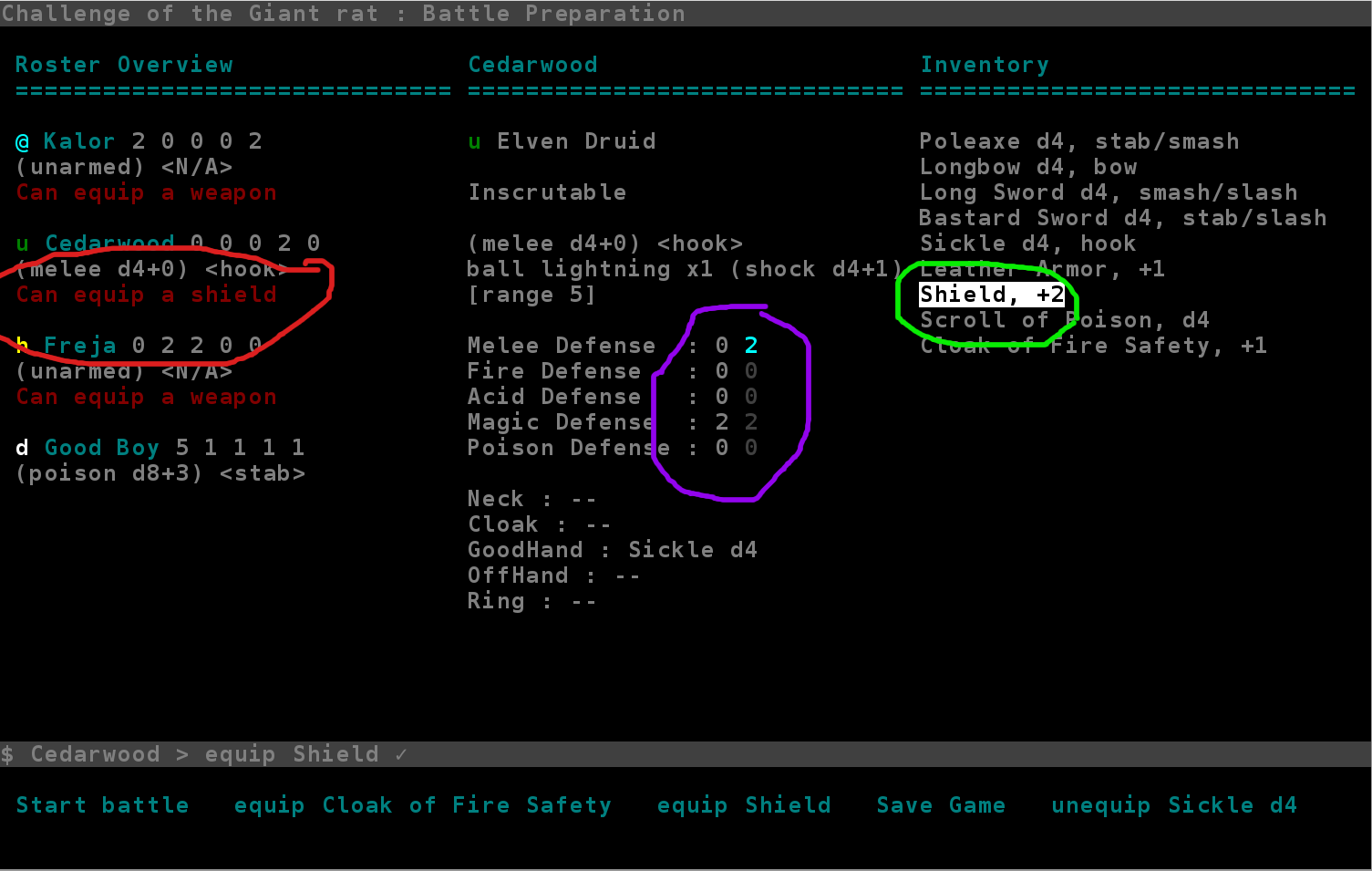
The screen shot didn't capture the mouse, but the items in the inventory list are mouse selectable. Circled in green is an item being hovered over. Clicking the item would equip it to Cedarwood. Circled in purple is a preview of the stat changes equipping a shield to Cedarwood would cause.
Like the combat interface, the battle preperation interface also has alerts (circled in red). These alerts tell the player whenever a party member has a free equipment slot which an inventory item could fill. If there are no alerts, the player knows they've equipped everything they could have equipped.
The Tactics Solution Review Interface

Project Site: http://antumbrastation.com/bedsui-project.html
Latest Version: 20180201
I’m back at development after a nice Christmas/New Years vacation, and this year starts with a gutting and rework of the user interface. Mainly replacing the command line with a more conventional mouse based interface. It took a solid month of coding, but the new mouse based interface is in a playable state (check out the latest release!!), and I’ve ripped out the last of the old command line code.
New Framework
Each time I've overhauled the game's interface (this is the third time), I first made a new interface framework before doing any of the actual interface work itself. The framework provides constraints which help with interface consitency, and the framework also provides a good architectural foundation to help the code quality.
Normally with these frameworks, the interface doesn't directly affect anything in the underlying game state. There is a list of commands, and the interface allows user to request one of those commands, but the command class itself (an not any interface code) makes the requested change to the game state. With the command line inteface, the arrangement was very basic; each available command had a name, and the user was just typing out the name of which ever command they wanted.
To make the new mouse interface easier, I've designed a tree based model for describing commands.

The start state for the user interface is the root node of the tree. Each node represents a piece of info for a command, and each complete path from root to leaf node is a complete command. The commands in the example tree are:
Code: [Select]
    kalor move a5
    kalor move a6
    kalor attack b3
    freja cast acid north
    freja cast acid west
    freja cast acid east
    freja move c8
    freja move d7
As the user interacts with the interface's current view, the user advances the interface through different nodes in the tree, and when a leaf node is reached that path formed from the root is the chosen command. At each node, the interface updates the view to show information relevant for choosing the next node.
The command tree is made pretty explicit at the bottom of the interface:

This widget can be used to directly move about the nodes of the command tree.
The Combat Interface
The new combat interface front-loads a lot more information.

Circled in red are important things the player needs to know but otherwise might overlook without a reminder. In this case one of the player's units, Good Boy, is within the range of enemy attack.
Circled in light blue is the log, which now records more than one event at a time and records less important events such as enemy piece movement (which the command line interface did not alert the player to). Nothing exciting about the log, it's the norm for roguelikes.
Circled in green is the new unit directory. My hope is that this will serve as a heads up display, letting the player know the defense stats (circled in purple) and melee attacks of every unit at a glance.

And as seen in a previous update, the battle map is mouse responsive and is the primary way I intend the user to select combat commands.
The Battle Preperation Interface

The screen shot didn't capture the mouse, but the items in the inventory list are mouse selectable. Circled in green is an item being hovered over. Clicking the item would equip it to Cedarwood. Circled in purple is a preview of the stat changes equipping a shield to Cedarwood would cause.
Like the combat interface, the battle preperation interface also has alerts (circled in red). These alerts tell the player whenever a party member has a free equipment slot which an inventory item could fill. If there are no alerts, the player knows they've equipped everything they could have equipped.
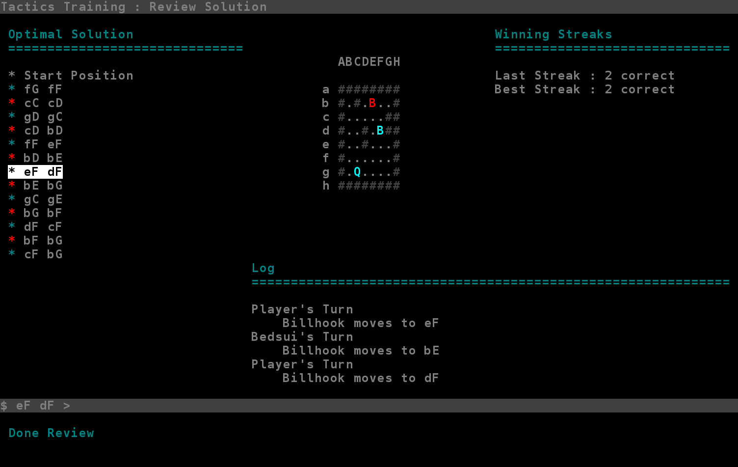
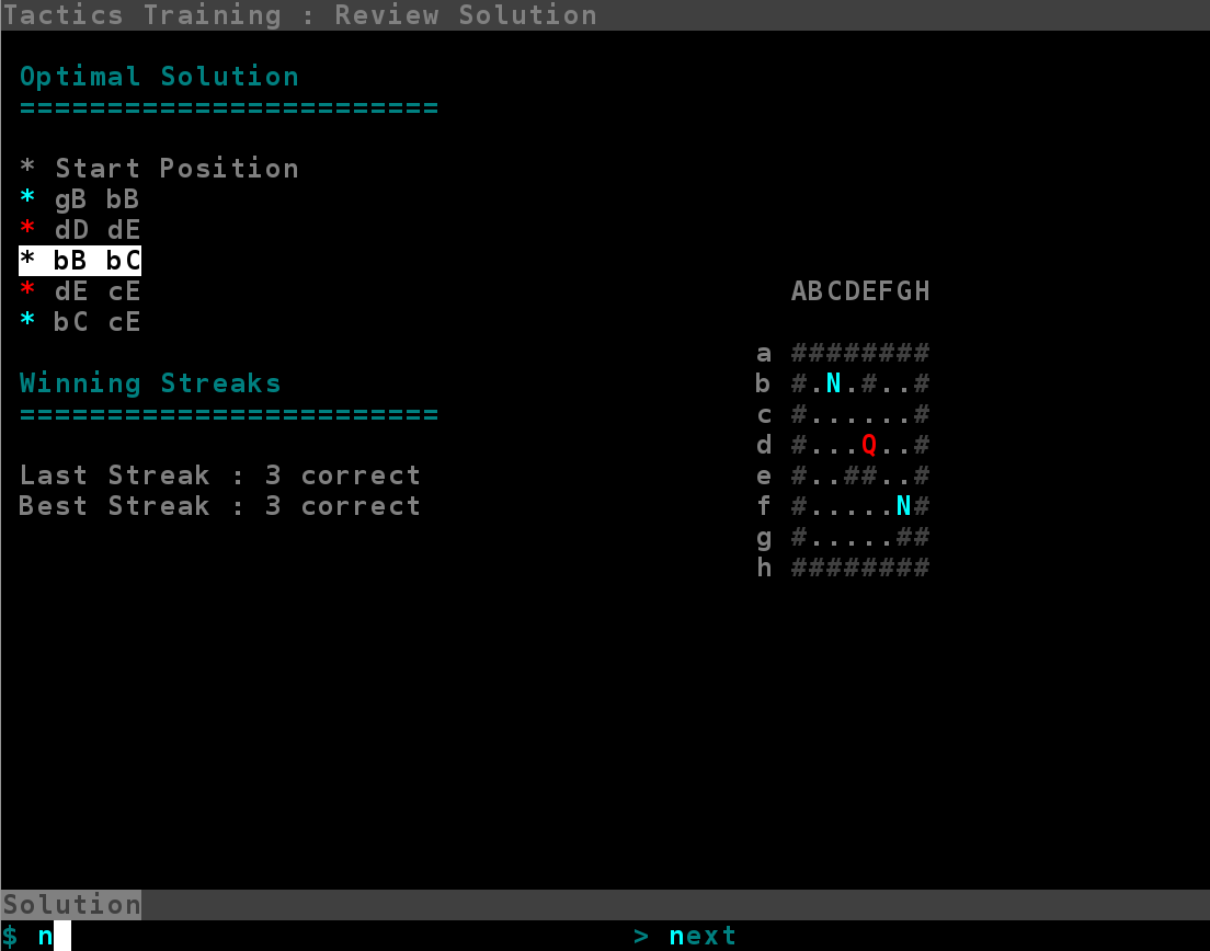
The Tactics Solution Review Interface
