Author Topic: The Thirty One Lieutenants of Sorcerer Bedsui - (Squad Based, Java, Fantasy)  (Read 8861 times)

stationmaster

  • Newcomer
  • Posts: 4
  • Karma: +0/-0
    • View Profile
The Thirty One Lieutenants of Sorcerer Bedsui

About:

The Thirty One Lieutenants of Sorcerer Bedsui is a Java roguelike, created as a prototype to show off novel, squad-based combat mechanics. I am hoping to incorporate feedback into a more ambitious game in the future, so feedback is very welcome.

All combatants, monsters and player characters, move about the board like tafl pieces (or the rook from chess), only stopping when blocked by a wall, unit, or wandering into an enemy's melee range. In most roguelikes, the melee range for units are the eight immediately adjacent squares. In T31LoSB different weapons provide different melee ranges specific to the weapon type. Units, player and monster, are fragile. Any attack which rolls higher than a unit's relevant defense stat is fatal. My intent is the create combat that focuses on maneuvering and coordinating a squad of various weapon types, and where trapping enemy units is the primary challenge of killing them instead of relying on more hit points and stronger attacks.

Project Site:

I have a playable alpha, as well as a bunch of screen shots, online here http://antumbrastation.com/bedsui-project.html
« Last Edit: November 12, 2017, 09:18:00 PM by stationmaster »

stationmaster

  • Newcomer
  • Posts: 4
  • Karma: +0/-0
    • View Profile
It's been a busy month for development.

Project Site

Command Line Improvements

Early feedback made clear that the typo tolerant features of the command line were hard to use correctly. Unless one is paying close attention, one might not notice the game interpreting small typos wrong (or against what one would expect anyway). This month I tried to improve the visual feedback and make it clearer what command the user is actually about to run, adding new color distinction to the auto complete.


What the user actually typed is highlighted in bright blue, and what the auto complete infers is tacked on in dark teal. If no command can exactly match what the user typed, the auto complete will show its best guess in yellow. Likewise, perfect matches are shown in green.

UI Re-architecture

I ported over the previously ad-hoc coded user interface screens to a more traditional Model-View-Controller architecture. It’s made for nicer, better tested code, and with the refactor it was easy to add a shared ‘help’ feature to all the user interface screens.

Puzzle Mode - Procedurally Generated Tactics Puzzles

Good games need good tutorials, and a good tutorial should feel like a natural extension of the game, teaching the player without them realizing they’re even playing the tutorial. Given the steep learning curve of the average roguelike (especially the Ascii variety), ‘The Thirty One Lieutenants of Sorcerer Bedsui’ especially needs a good tutorial.

If you’ve ever studied chess seriously, you’re probably familiar with the concept of a tactics puzzle. In a tactics puzzle, the student is presented with a board position and has to choose the best move to play, usually with the objective of winning a large piece advantage or checkmating the opposing King in ‘X’ number of moves.

I enjoy chess tactics puzzles. They’re fun in their own right, and they’re one of the best ways to improve quickly. More importantly, T31LoSB draws heavy inspiration from chess. If tactics puzzles can teach people chess, tactics puzzles can teach people to play T31LoSB as well. This month I added a new tactics puzzle mode, while not finished, is playable!


The puzzles aren’t what I expected, but not in a bad way. Unlike traditional chess puzzles, where deviating from the correct line is strictly wrong and an automatic failure, my procedural puzzle generator produces more flexible puzzles with multiple solutions. One of the solution paths is usually shorter, and therefore ‘better’, but the player can recover from a minor mistake. The only comparable chess tactics puzzles I know of are the endgame puzzles on Chess Tempo, which punish you for being inefficient but won’t outright fail you. Importantly though, the harder puzzles are genuinely challenging without being inaccessibly difficult.

There’s still work to do. I’d like a greater variety of puzzles for one. Currently all the puzzles use the same, empty 5 by 5 arena, so the puzzles only have so much room to be different. Hopefully, procedurally generating the arenas as well as the piece layouts will solve that.

Generating the puzzles is also slow. Not prohibitively, but it does take fifteen seconds to create puzzles with three pieces. I don’t think I can speed that up, but I can multi thread the generation to make the next puzzle while the player is solving the current one.


Avagart

  • 7DRL Reviewer
  • Rogueliker
  • *
  • Posts: 567
  • Karma: +0/-0
    • View Profile
Huh, nice and original idea, it seems. I'll take a look when I find some spare time.

stationmaster

  • Newcomer
  • Posts: 4
  • Karma: +0/-0
    • View Profile
Huh, nice and original idea, it seems. I'll take a look when I find some spare time.

Thanks! If you have any critique, I'd love to hear it.

----------

This month in development:

Project Site: http://antumbrastation.com/bedsui-project.html
Latest Version: 20171205

Save Games

I added the ability to save the game, which was probably the last major feature needed to make this truly playable. Currently, one can only save while in between lieutenant fights.

Game Balance

I nerfed the party druid, Cedarwood. A friend was helping with some play testing, and on one of his runs he slipped up and Cedarwood died. Instead of playing through the loss, he started a new game because Cedarwood’s magic attacks were too critical to try playing without. I probably would have quit then too. When I play, I almost always defeat enemy lieutenants by first cornering them and then blasting with Cedarwood’s lightning spell. To balance the team, I removed Cedarwood’s ability to use magical scrolls, giving that ability to the underpowered Freja. The player still gets two magical attacks at the start of the game, but losing one character won’t cost both those spells.

Game Pacing

Over the holidays (American Thanksgiving), I got a chance to see my brother and have him play test T31LoSB. He’s seen previous prototypes of the Tafl/Chess combat system, but never played this incarnation, and he focused on the sluggishness of the actual battles. First was how long commands take to type out. Take the following two commands:

Code: [Select]
    move range <row column>
    threat range <row column>

The crucial piece of info the predictive text matcher needs to guess the command is all the way at the end. The player has to type out “move range” and “threat range” every time. Compare the alternative:

Code: [Select]
    <row column> move range
    <row column> threat range

With the commands structured to have row and column first, the predictive text matcher can uniquely identify the command as soon as the ‘m’ in “move range” or ‘t’ in “threat range” is typed. Much less annoying. At some point in the future I’m planning to go over every command and make sure the crucial info is front loaded to optimize typing speed. For now I just fixed the more obviously annoying commands, such as the example two.

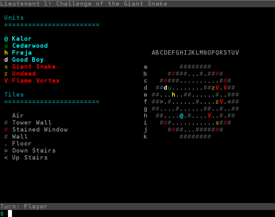
The next issue was how many turns are needed to win a battle. There’s too much time spent on initial piece deployment; openings last longer than in chess, despite each side having half as many pieces. Chess is played on a tiny board, 8 by 8, compared to battlefields in T31LoSB, 15 by 30. The bigger playing field slows down everything with the extra moves wasted just covering the distance, so I tried cutting down the board to 9 by 18. It’s quite a size reduction, having less than one half the squares the old, larger board had, and it feels faster (at least to me).

The smaller board has had other useful effects too. The computer AI has an annoying tendency to leave its lieutenant unguarded, making for easy, boring wins. On a smaller board the computer’s pieces are naturally clustered close, so it’s more likely a piece will be near by to protect the lieutenant. The AI hasn’t changed, but it plays stronger.

The density of pieces, both the player’s and the computer’s, also increases how often tactical combinations arise; closer pieces mean more possibilities and more interesting positions.


Improving the Tactics Puzzle Mode

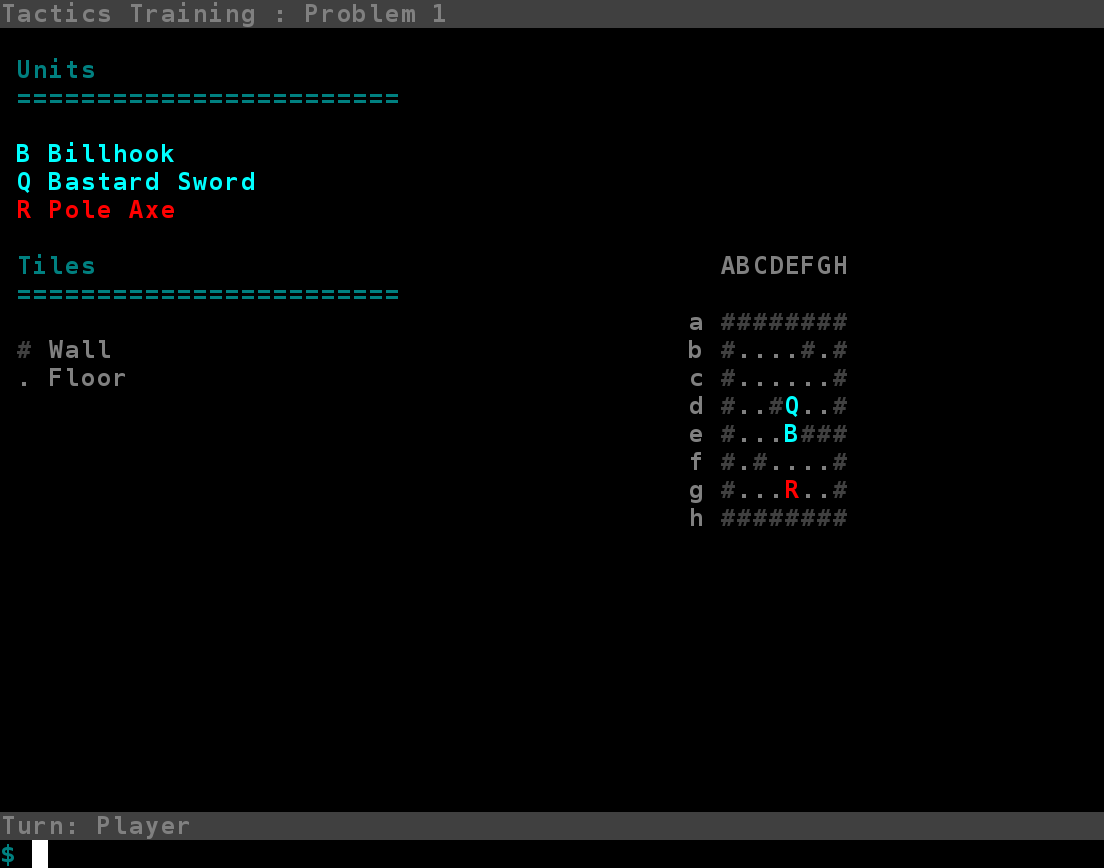
Performance wise, puzzles still take roughly fifteen seconds to generate, but I’ve implemented a multi threaded Consumer/Producer pattern to get around this. While the player is solving one puzzle, a background thread generates new puzzles and enqueues the new puzzles into a thread safe queue. When the player needs a new puzzle, the main game thread pops one of the pre-made puzzles off the queue. From the player’s perspective, new puzzles are generated instantly.

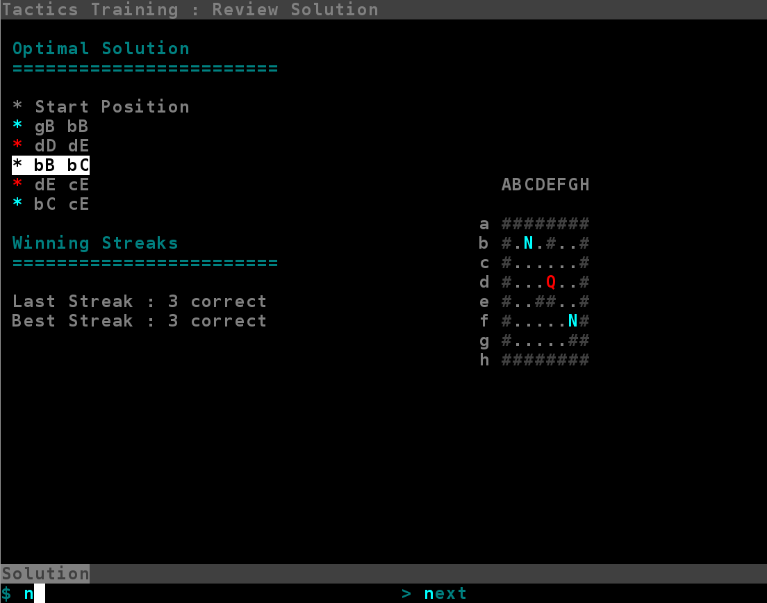
The tactics puzzle mode now has a puzzle solution screen. Previously, when the player failed a puzzle the game would just move onto the next puzzle with no explanation of why the player’s moves were wrong or what the correct solution was. I still haven’t done anything about the first issue, but now the game will explain the optimal solution. The player can step through the moves of the solution, seeing the board for every move.

I’ve added procedurally generated walls to the two-on-one puzzles. More kinds of tactics emerge now.


stationmaster

  • Newcomer
  • Posts: 4
  • Karma: +0/-0
    • View Profile
This month in development:

Project Site: http://antumbrastation.com/bedsui-project.html
Latest Version: 20180201

I’m back at development after a nice Christmas/New Years vacation, and this year starts with a gutting and rework of the user interface. Mainly replacing the command line with a more conventional mouse based interface. It took a solid month of coding, but the new mouse based interface is in a playable state (check out the latest release!!), and I’ve ripped out the last of the old command line code.

New Framework

Each time I've overhauled the game's interface (this is the third time), I first made a new interface framework before doing any of the actual interface work itself. The framework provides constraints which help with interface consitency, and the framework also provides a good architectural foundation to help the code quality.

Normally with these frameworks, the interface doesn't directly affect anything in the underlying game state. There is a list of commands, and the interface allows user to request one of those commands, but the command class itself (an not any interface code) makes the requested change to the game state. With the command line inteface, the arrangement was very basic; each available command had a name, and the user was just typing out the name of which ever command they wanted.

To make the new mouse interface easier, I've designed a tree based model for describing commands.


The start state for the user interface is the root node of the tree. Each node represents a piece of info for a command, and each complete path from root to leaf node is a complete command. The commands in the example tree are:

Code: [Select]
    kalor move a5
    kalor move a6
    kalor attack b3
    freja cast acid north
    freja cast acid west
    freja cast acid east
    freja move c8
    freja move d7

As the user interacts with the interface's current view, the user advances the interface through different nodes in the tree, and when a leaf node is reached that path formed from the root is the chosen command. At each node, the interface updates the view to show information relevant for choosing the next node.

The command tree is made pretty explicit at the bottom of the interface:


This widget can be used to directly move about the nodes of the command tree.

The Combat Interface

The new combat interface front-loads a lot more information.


Circled in red are important things the player needs to know but otherwise might overlook without a reminder. In this case one of the player's units, Good Boy, is within the range of enemy attack.

Circled in light blue is the log, which now records more than one event at a time and records less important events such as enemy piece movement (which the command line interface did not alert the player to). Nothing exciting about the log, it's the norm for roguelikes.

Circled in green is the new unit directory. My hope is that this will serve as a heads up display, letting the player know the defense stats (circled in purple) and melee attacks of every unit at a glance.


And as seen in a previous update, the battle map is mouse responsive and is the primary way I intend the user to select combat commands.

The Battle Preperation Interface


The screen shot didn't capture the mouse, but the items in the inventory list are mouse selectable. Circled in green is an item being hovered over. Clicking the item would equip it to Cedarwood. Circled in purple is a preview of the stat changes equipping a shield to Cedarwood would cause.

Like the combat interface, the battle preperation interface also has alerts (circled in red). These alerts tell the player whenever a party member has a free equipment slot which an inventory item could fill. If there are no alerts, the player knows they've equipped everything they could have equipped.

The Tactics Solution Review Interface