Author Topic: My Rogue Like Pixel Art  (Read 27073 times)

niko

  • Newcomer
  • Posts: 8
  • Karma: +0/-0
    • View Profile
My Rogue Like Pixel Art
« on: March 01, 2016, 03:21:34 PM »
Hello everyone, I am new to the rogue-like community but have been in the game developing community's for sometime now. I am a 2d pixel artist and have been creating art for many years. I specialize in rpgs, adventure games, platformers and now rogue-like graphics.

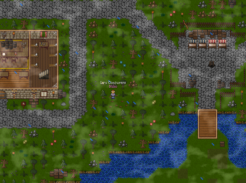
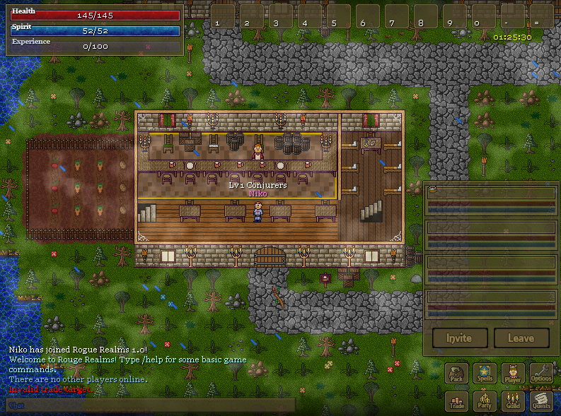
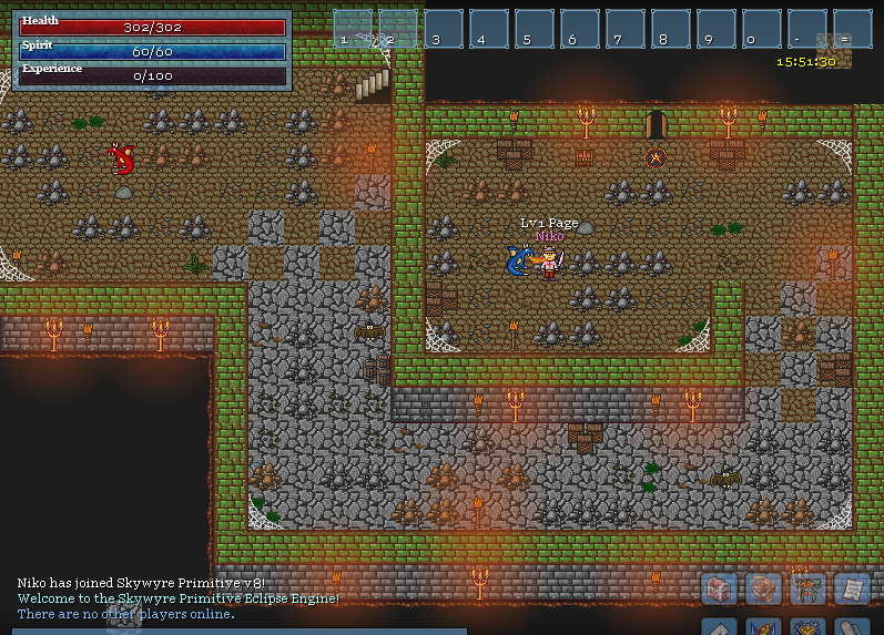
Im here to show off a new tile set, and set of game assets I have simply titled rogue realms for now. I was hoping to get your opinions of my artwork since you are all rogue-like experts. I was also wondering if any of you purchased or licensed artwork for commercial projects? Or if you just used free art for these types of games. What do you think a fair price would be on a graphics set like this? It would include many tile-sets, many characters, many item icons, paper-dolls, animations ex. I'm simply curious.

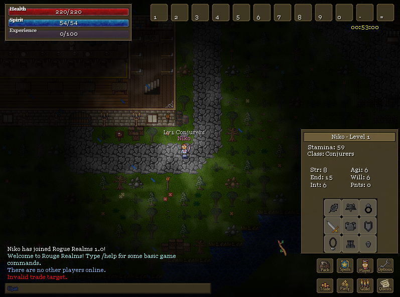
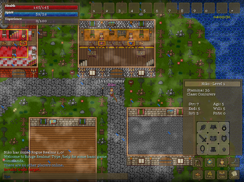
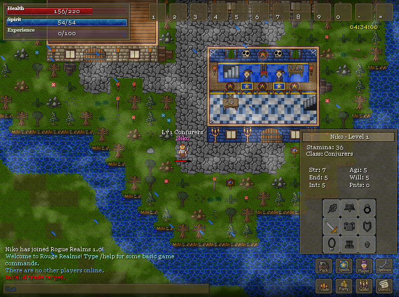
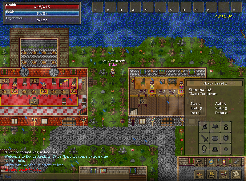
Here is a preview of my art.
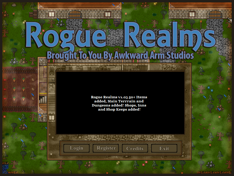


Please note as far as houses and dungeons and things go, I have many floor, wall and decoration tiles. I Cannot use them all in every screenshot so don't think what is being shown is all there is. There are so many more!
« Last Edit: March 03, 2016, 11:42:07 PM by niko »

Tzan

  • Rogueliker
  • ***
  • Posts: 193
  • Karma: +0/-0
    • View Profile
Re: My Rouge Like Pixel Art
« Reply #1 on: March 01, 2016, 06:19:02 PM »
These look really good!
I'm not in the market for tiles.
I do know how much work goes into this, I've done quite a bit of pixel art over the years.

I would suggest looking into selling this on the Unity Asset Store.

Maybe do a two tier system.

1- A small set of tiles just grass, 2 trees, one set of wall pieces 3 characters.
Give for free or $5 -$10, so people have something to prototype with.

2- Full Set Pro version, whatever price, no idea really. ( $20 - $50 ? )

reaver

  • Rogueliker
  • ***
  • Posts: 207
  • Karma: +0/-0
    • View Profile
Re: My Rouge Like Pixel Art
« Reply #2 on: March 01, 2016, 06:51:52 PM »
They are not as red as I thought they would be, mon ami  ;)

Tilded

  • Newcomer
  • Posts: 49
  • Karma: +0/-0
    • View Profile
Re: My Rouge Like Pixel Art
« Reply #3 on: March 02, 2016, 12:03:40 AM »
Well it is bleu where it is spelled correctly.

niko

  • Newcomer
  • Posts: 8
  • Karma: +0/-0
    • View Profile
Re: My Rouge Like Pixel Art
« Reply #4 on: March 02, 2016, 04:13:52 AM »
Not as red as you thought it would be?

AgingMinotaur

  • Rogueliker
  • ***
  • Posts: 805
  • Karma: +2/-0
  • Original Discriminating Buffalo Man
    • View Profile
    • Land of Strangers
Re: My Rouge Like Pixel Art
« Reply #5 on: March 02, 2016, 07:47:17 AM »
It's that old RL pun, based on how it's common to misspell "Rogue" as "Rouge" (ie. "red"). VoilĂ -voilĂ .

As always,
Minotauros
This matir, as laborintus, Dedalus hous, hath many halkes and hurnes ... wyndynges and wrynkelynges.

Krice

  • (Banned)
  • Rogueliker
  • ***
  • Posts: 2316
  • Karma: +0/-2
    • View Profile
    • Email
Re: My Rouge Like Pixel Art
« Reply #6 on: March 02, 2016, 08:28:43 AM »
These tiles look quite "stuffed" which means there are lot of details and colors in each tile. In design and gameplay perspective it's better to emphasize only important things like items and monsters. You can see this problem even in big games like ADOM, where some items are too small and easily disappear in the background tiles. I think sometimes artists don't realize it so working with a good game designer is important, because he can give advice on how much you need to make certain tiles stand out.

reaver

  • Rogueliker
  • ***
  • Posts: 207
  • Karma: +0/-0
    • View Profile
Re: My Rouge Like Pixel Art
« Reply #7 on: March 02, 2016, 08:32:46 AM »
You have 2 different variants on the same "title" screenshot. The big blue letters (spelled correctly) and the white letters in the black box, where you spell it wrong. I can understand typos and spelling mistakes (e.g. "Challange", bottom-left), but not in the *product title*...

By the way, sorry to be nitpicky, I just hate this misspelling -- tiles look good, they probably need some masks to shine. I'd also agree with Krice on that the background tiles have too much contrast and stand out too much, therefore making it a bit difficult to say what's foreground and what's background

Tzan

  • Rogueliker
  • ***
  • Posts: 193
  • Karma: +0/-0
    • View Profile
Re: My Rouge Like Pixel Art
« Reply #8 on: March 02, 2016, 04:59:27 PM »
These tiles look quite "stuffed" which means there are lot of details and colors in each tile.

Thats a good point.

You can really see it in the floor tiles of buildings.
The wood planks are good, darker and simple, characters are easy to see.
The other rooms like the bank, the floor is brighter and lots of detail.

niko

  • Newcomer
  • Posts: 8
  • Karma: +0/-0
    • View Profile
Re: My Rouge Like Pixel Art
« Reply #9 on: March 02, 2016, 05:07:48 PM »
Sorry for the spelling errors but these mockup images are just drafts. The bright contrast of colors is just the cartoon style I chose for this set. Also the crowded high detail look is just how I create levels. You can choose to use the tiles however.

Zireael

  • Rogueliker
  • ***
  • Posts: 604
  • Karma: +0/-0
    • View Profile
Re: My Rouge Like Pixel Art
« Reply #10 on: March 02, 2016, 06:13:55 PM »
What is the tile size? 16x16?

niko

  • Newcomer
  • Posts: 8
  • Karma: +0/-0
    • View Profile
Re: My Rouge Like Pixel Art
« Reply #11 on: March 02, 2016, 06:24:18 PM »
32x32

Zireael

  • Rogueliker
  • ***
  • Posts: 604
  • Karma: +0/-0
    • View Profile
Re: My Rouge Like Pixel Art
« Reply #12 on: March 02, 2016, 07:39:29 PM »
32x32

This is amazing! I'm using free 32x32 tiles in my own roguelike, but your chairs and barrels, for instance, blow those out of the water!

As for pricing, I suggest a free version (sans animations) and a paid version, between 5 and 15 dollars, with animations.

niko

  • Newcomer
  • Posts: 8
  • Karma: +0/-0
    • View Profile
Re: My Rouge Like Pixel Art
« Reply #13 on: March 02, 2016, 09:07:01 PM »
Thank you all for your input!!! I guess I will probably release a small free version of this. Without all the extra goodies. Now as for the tile look. Should I make proper transitions between sand, and mud, and grass tiles? Or stick with the blocky tile look for retro purposes?

Quendus

  • Rogueliker
  • ***
  • Posts: 447
  • Karma: +0/-0
  • $@ \in \{1,W\} \times \{1,H\}$
    • View Profile
    • Klein Roguelikes
Re: My Rogue Like Pixel Art
« Reply #14 on: March 02, 2016, 10:20:40 PM »
Proper transitions for all the 9^4=6561 combinations of sand, mud, grass, and water tiles would be very time-consuming, even more so if you did separate transitions for each of the 3 different "shades" you have there. Corner Wang tiles would lessen the workload, but you're probably better off sticking with sharp transitions. ;)